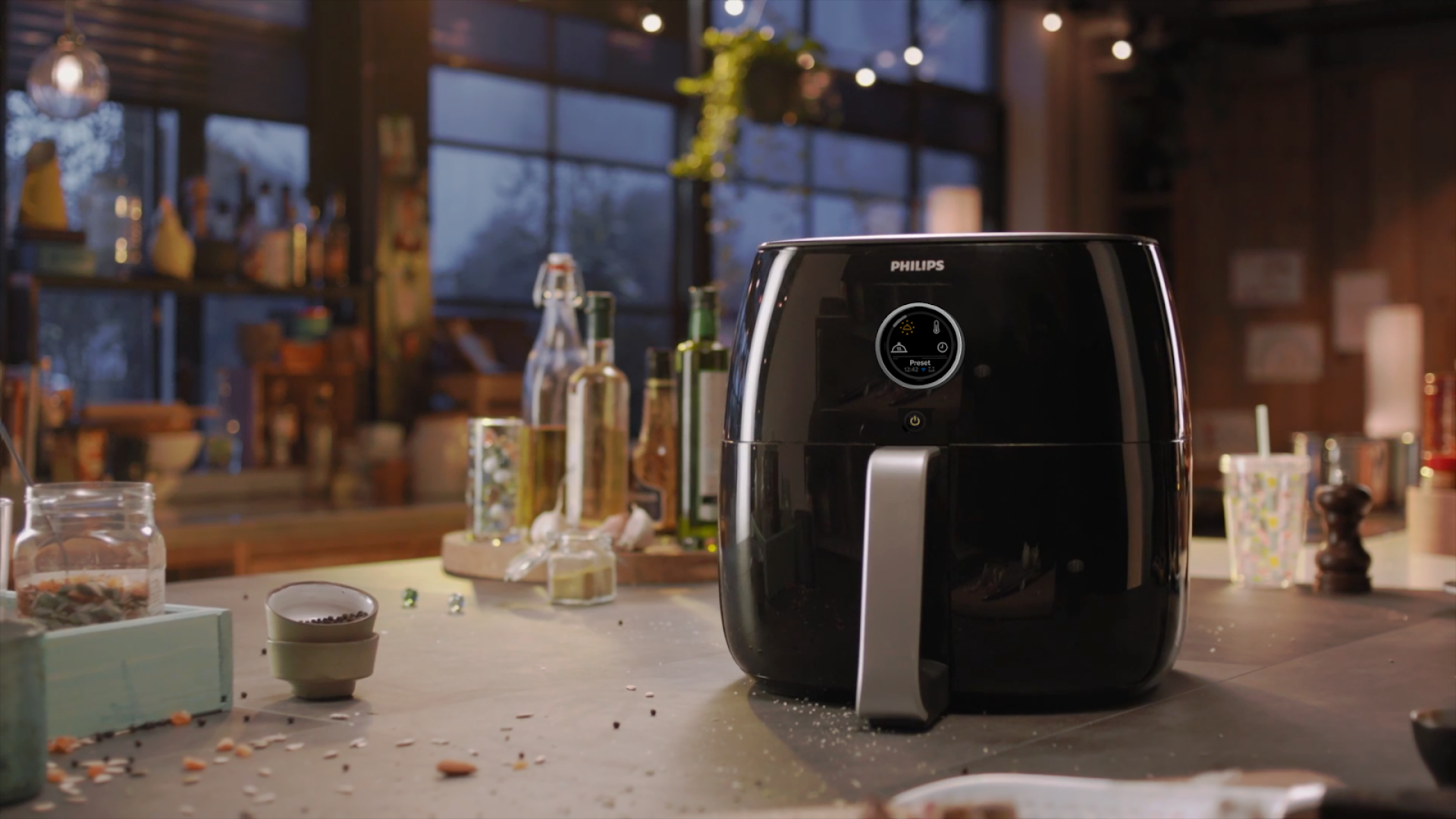
Redesign: Philips Airfryer XXL
Master Semester 1 (2020 Feb~Jun)
Teamwork:
Ji-Youn Jung, Aniek Kempeneers, Paula Hueso, Mohamed Fayed, Tao Chen
Problem:
Amid growing competition in airfryer market, Philips was looking to improve their user experience that can help them stand out to consumers. We were asked to analyze the product Airfryer XXL and define problems ourselves, with suggesting possible solutions.
The overarching issue we found is “lack of integration of the Airfryer XXL in the user personas’ current cooking rituals”. We believe the product can utilize its full potential by providing a well-integrated user experience in regular cooking tasks and traditional kitchen settings. The sub- issues we found are explained and argued in the following paragraphs. The hierarchy indicates the degree of importance to solve per usability and/or user experience issue.
Product Analysis
Steps of anaylsis we conducted to define UX Qualities
We used the airfryer in kitchen context to get deeper insight
Cognitive Jogthrough
We experimented cooking drumsticks with it. The result was phenomenal- crispy and juicy!
Problem Definition
1. Lack of guidance in cooking progress
In the current situation, the Airfryer XXL is not supportive in providing users with clear information about its functions and the order in which they can be operated. The main reason why this is a problem is that the users might find it hard to relate to the graphic design of the icons with their respective functions. This can lead to confusion, especially in first time uses.
2. Unclarity of feedback in cooking progress
The kitchen can be a noisy and distracting space with many sounds and social encounters. Clear feedback from the device on cooking progress is important for effective communication. In the current situation, the visual and auditory feedback is unfortunately low and dim. Users might miss the feedback, which makes them feel frustrated as cooking is usually composed of a series of tasks which will now be negatively affected. However, loud and obtrusive signals can cause distraction and annoyance, leading to a negative user experience which should be avoided.
3. Lack of awareness of multifunctionality
Philips’ goal is to encourage people to use their Airfryer XXL everyday. However, this goal is not yet met as it is used approximately three times per week, according to the stakeholder. In the current situation, the user personas often perform their cooking tasks with traditional kitchen appliances (e.g. stove, oven). As a result, the user personas feel familiar and have more experience with them. Despite Philips’ effort to provide users with recipes to encourage multiple types of use (i.e. toasting, grilling, baking), the Airfryer XXL is not yet perceived as a substitute or unmissable addition for these (traditional) appliances as it is for a deep fry.
Concept Ideation & Design
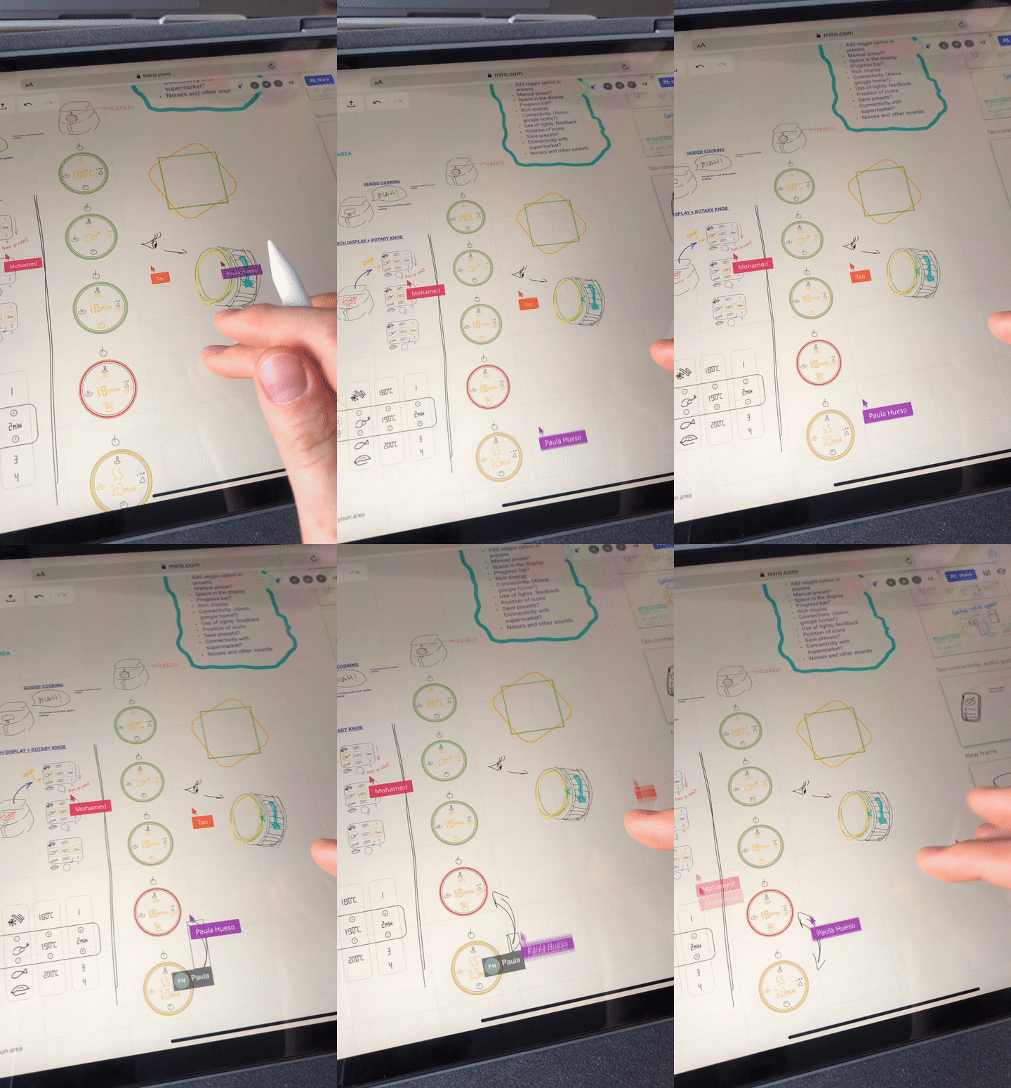
Team Idea sketching session result. Conducted on Miro board due to pandemic.
Three Concepts
We designed three concept directions that we wanted to study and test further.
Concept 1:
The Matrix Selector
The first concept explores the possibilities to rearrange the current interface in an order that matches the actual task sequence as described in the intended use section. The action steps are arranged from left to right in the same non-digital display as the original product.
Concept2:
The Single Screen
The second concept emphasizes the rotary knob and uses the surface on the button to interact with the appliance. The goal with this concept is to allow users to focus on their use goal by eliminating most of the elements displayed on the current Airfryer XXL.
Concept 3:
The Remote Control
The third concept has an additional function that is added to the current Airfryer XXL. Changes are mainly made in the UI and functionality of the Nutri U application and not on the appliance itself. The connectivity is added to the concept in order to test it with users.
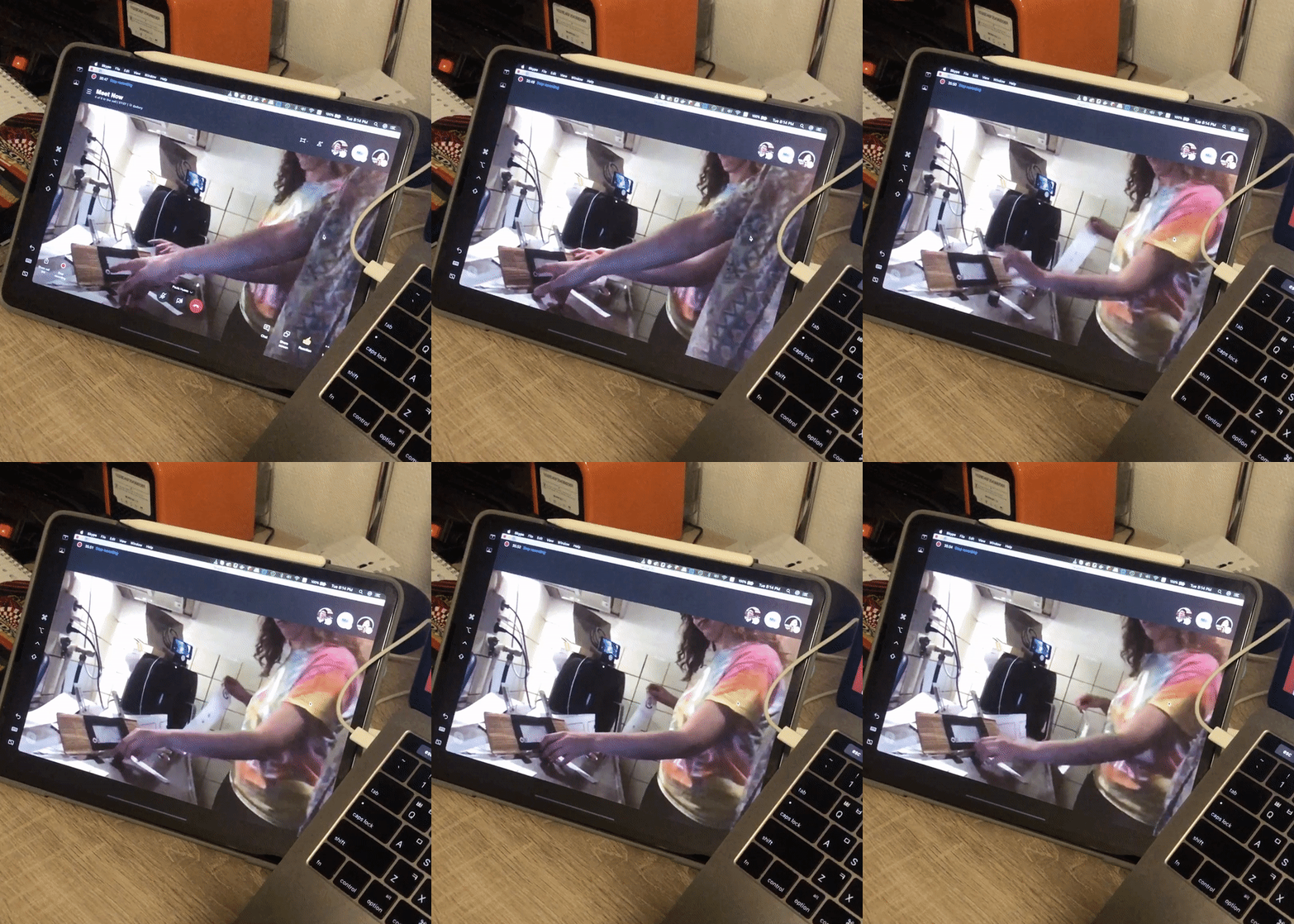
Concept User Test
Concept Analysis
Analysis 1
Making Sense Analysis
The Make Sense analysis, as its name might suggest, intends to analyze and comprehend all the information we received per participant in a structured way. As it is the first step of the process, it is not really accurate and conclusion-oriented yet, but it provides the team members a quick and specific access to raw data gathered in the tests that could be easily revised afterwards.
Analysis 2
Data Tables
This tables collect the behavior of the participants in each task and compare the actions they performed with the intended interaction to identify possible problems or struggles to tackle. As the goals of both tasks were achieved correctly by the participants, we divided them into smaller steps to specify which ones were more problematic. For that, a color code was used to have clear overview of the steps that the users performed.
Analysis 3
System Usability Scale & User Experience Questionnaire
The System Usability Scale uses 10 items for which scores are given on a 1-5 point Likert Scale. The scores are transformed to 100 points maximum. The User Experience Questionnaire results are displayed in the figure below.
Analysis 4
UX Qualities
The UX Qualities were assessed by analyzing all previous results from step 1, 2 and 3. Based on the design vision as described in the design brief, four main UX qualities were analyzed: Easy to Use, Clear, Guiding and Familiar.
Analysis 5
Severity Analysis
The last data analysis step interprets all data from the previous steps and categorized the issues and strenghts found among the concepts according to severity. The goal was to establish priority of tackling issues and leveraging strengths to draw conclusions for the converging strategy. The team analyzed per participant and per task and assigned a score separately.
Final Concept:
Here we present our final outcome, Rich Display Knob and the connectivity function that has been integrated into the current Philips Nutri U application. The main idea here was that we keep the ‘rotary knob’ which was the key UI of current airfryer, and emerge the other buttons which have some shortcomings into the Key UI itself.
Screen
Type
OLED
Operation Control
Rotary knob
Placement
visual unity, right- and left-hand operation
Size
Rotary knob diameter (60 mm),
on/off button diameter (12 mm)
Navigation
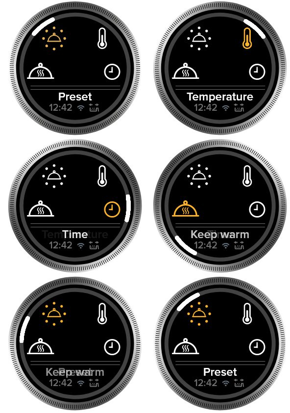
Let’s now take a look to the graphic design of the rich display, we further divided the screen into a primary area on the top where you can access the main functions,/ and the secondary one on the bottom which gives additional information such as what you have selected in the primary area . When it comes to the icons, we redesigned and tested their appearance, which we might further explain later. The animation on the right shows you how it would look like if a user was turning the knob.
Function Overview
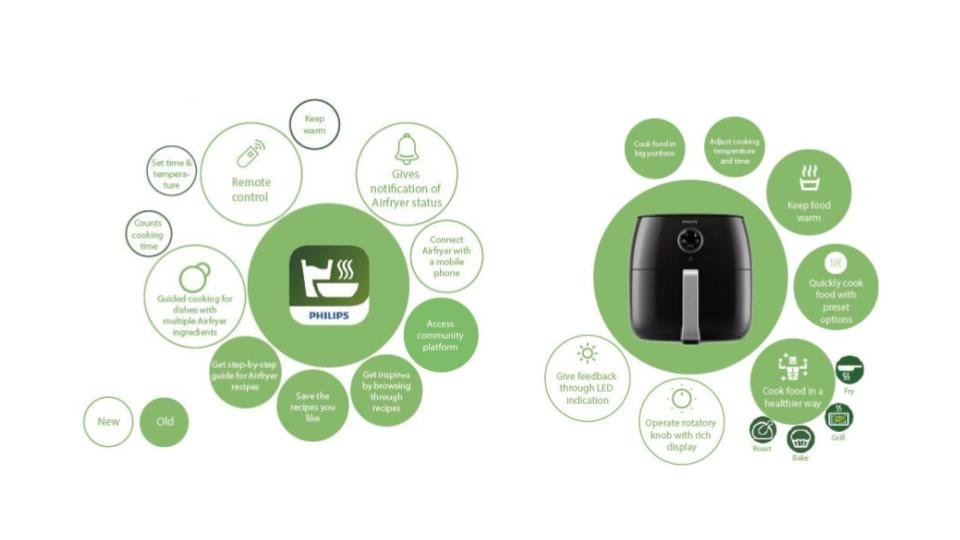
We kept all the previous functions that Philips Airfryer and the byproduct service NutriU application originally have. Most radical changes were made only in the connectivity function on the NutriU app side, and on the device itself new functions are mainly for clearer feedback purposes.
Mobile Interface: Connectivity
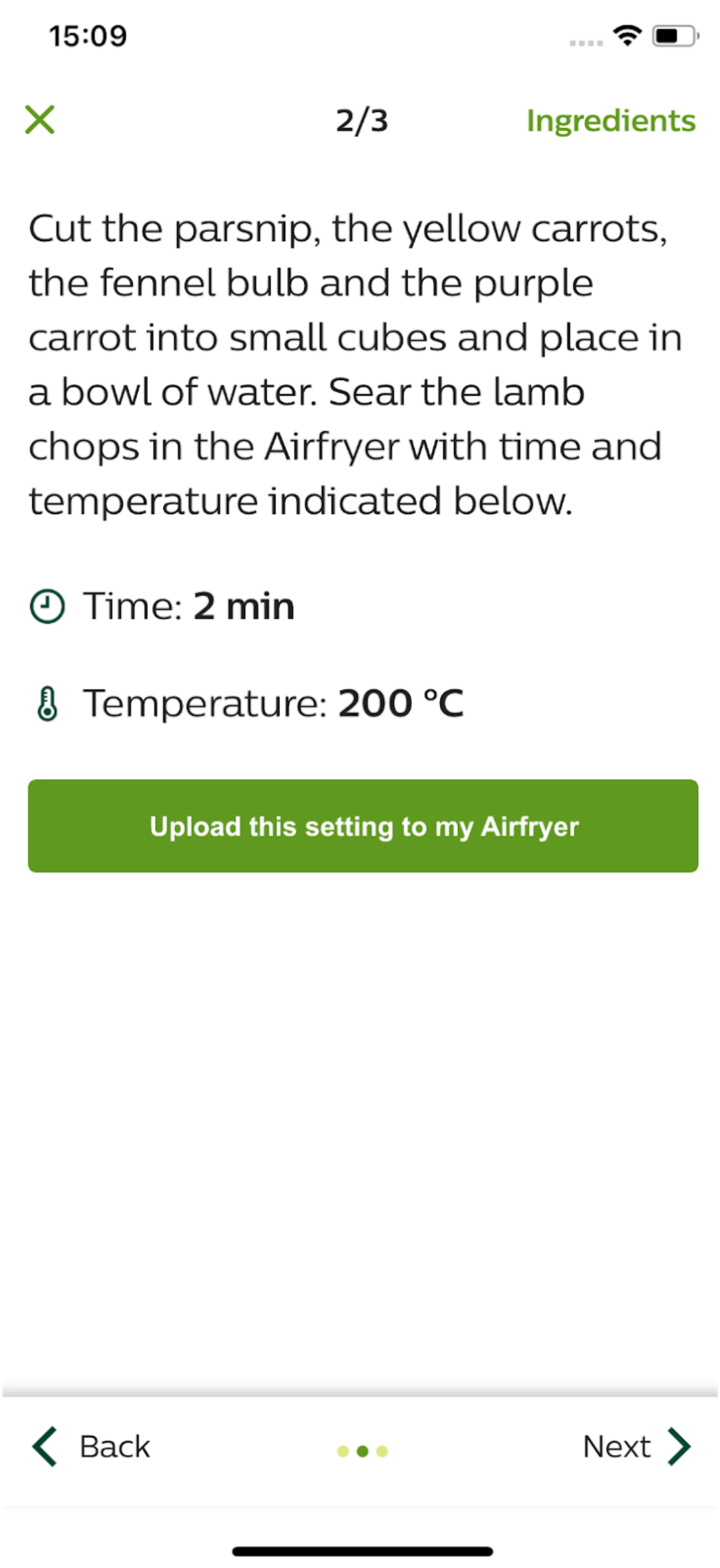
We decided to add this function to give more guidance to users in managing cooking tasks, by giving them notification when the food is finished, and to encourage them to utilize variety of recipe choices that Philips provide, only by ‘uploading’ the setting from the recipe page. However, it’s important to mention that device works completely fine alone itself, this connectivtiy function is entirely an added secondary function to the device.
In Conclusion
Solution 1: More guidance in cooking process
So how does this solve the problems we mentioned earlier? you may ask. The rotary ring that follows users as they rotate the knob, and the text description on the bottom of interface enhances the clarity immensely. Also using this display knob will allow Philips to curate more preset options than five. Suggestion to shake the cooking tray will make the product feel more ‘guided’.
In Conclusion
Solution 2: Clear feedback in cooking process
This redesign also improves the feedback of the machine, by communicating the state on the screen. Connectivity function also assists on the clear feedback by giving extra channel to the communication. The rotary ring that indicates the left-cooking time visualizes the time more intuitively, which enhances the clarity of feedback.
In Conclusion
Solution 3: More awareness to the multifunctionality
Lastly, this concept improves the third point, the lack of awareness to the multifunctionality. By providing connectivity function, Philips encourage user to utilize the vast recipe libraries. The hurdle gets lowered when they can easily ‘upload’ the settings, and are ‘guided’ by the steps. Also, again, Philips can display more than five options on the display and can include the vegetables, where it fits more to users expectations on ingredients.
